Just a list of screenshots of sites I like. I’ll add to it from time to time as I stumble across more
Kev’s site is built with Kirby but it’s the custom stylisation that I love. It’s fun without being complicated or in your way (although I still would prefer the content was centered on desktop size screens).
Nothing, not even a menu to pull you away from the content that’s front and center. And a beautiful way to display text links.
https://blog.jim-nielsen.com/2024/my-failed-peronsal-site-redesign

This one’s cheating a bit since it’s a proposed redesign not an actual site but the hand drawn style is so damn cool I figure it’s worth including for inspiration.

Simple. A bit nerdy. Beautiful.

A little bit of nature making a calm simple page with a nice little growing animation to boot.
Fun with link colours.
The simplicity of sites made with Pika is great. No clutter, just a blog with blog posts
https://buttondown.email/ownyourweb/archive
Archives on Buttondown look good by default but they also can be tweaked to fit your own style.
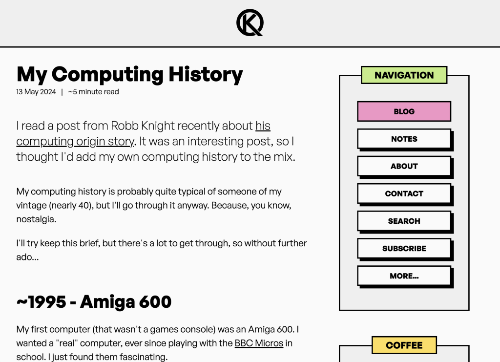
Another fun site without being complicated, this time with a colourful dark theme.
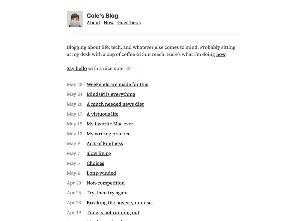
So simple and readable.

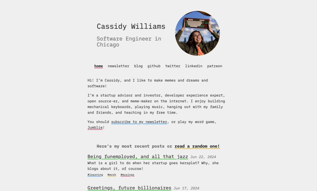
I’m a sucker for quirky colour; instant personality. Also toggling dark mode on this site is great fun.

No mistaking who’s site you’re on here. The speckled background also has a certain charm I can’t explain.

Love these colours.
https://owickstrom.github.io/the-monospace-web

Not a blog but I love a nerdy site design.

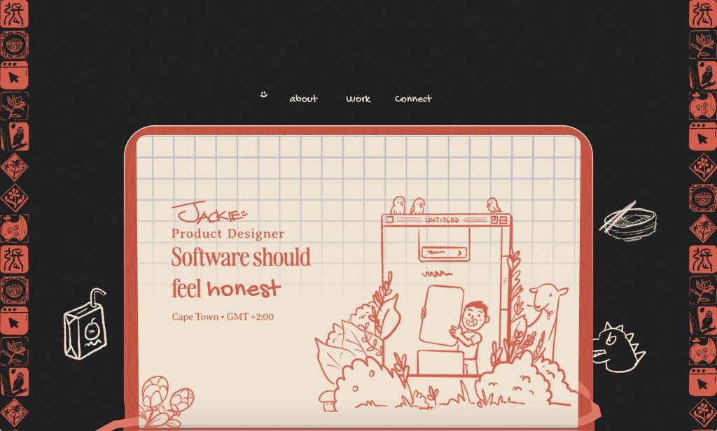
Another beautiful hand drawn site. You really have to scroll this one (and hover over the main menu options) to appreciate it fully. This one only works well on desktop currently.
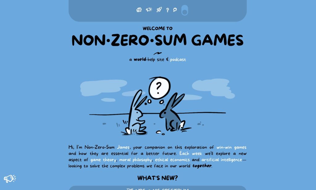
I can’t get enough of this drawing style. Beautiful colours as well.